NOTES
fine art —> personal —> tailor made —> hand made
graphic —> commercial —> mass production
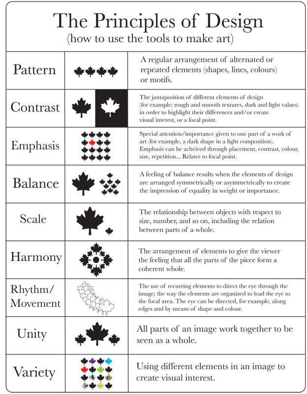
PRINCIPLE & ELEMENTS
balance. COLOR
proportion. LINE
Sequence. TEXTURE
Emphasis. TYPE
Unity PATTERN
Contrast. SHAPE
Repetition
Harmony
RECOMENDED FONT WEB:
-atipofoundry.com
-fontsinuse.com
-myfont.com
graphic —> commercial —> mass production
PRINCIPLE & ELEMENTS
balance. COLOR
proportion. LINE
Sequence. TEXTURE
Emphasis. TYPE
Unity PATTERN
Contrast. SHAPE
Repetition
Harmony
RECOMENDED FONT WEB:
-atipofoundry.com
-fontsinuse.com
-myfont.com
DEPTH MEANING
01. Perception
(the aspect of visual solutions that make us look at a piece.
Visual hierarchy. contrast, color, and imagery are all formal.
Qualities to grab the viewer’s attention and draw him into the work
multilayered imagery and prahics, as well as other cool looking visual
“eye candy” May pique the viewer’s interest. but fail to communicate)3
02. Sensation
(images with tactile qualities cause viewers to experience gut
reactions to the work, such images have the power to either. repulse or
arouse the audience’s curiosity)
03. Emotion
(appealing to the viewer’s emotions rather than his reason has
enormous power or persuasion. Positive and negative emotions
such as love, trust, confidence and fear are all employed heavily by
advertising to sell products or lifestyles.)
04. Intellect
( the power or words in design and subtleties such as wit and
humour appeal to both right and brain rationale. Images requiring
participation and interaction the viewer with deeper comprehension
and understanding.)
05. Identification
(The power to identity and to be able to recognise visually in
relations to every subject matter. likewise, images requiring audience
participation and interaction reward the viewer with deeper comprehension
and understanding.
06. Revebretation
(nostalgic imagery often elicits comfot and dependability. In
visual messages, Referencing history and tradition tends to resonate
with the viewers as being true)
07. Sprirituality
( This is employed when a work’s moral and artistic qualities
converge to deliver a message. verything about the communication,
from concept to excution. work in pieces of this mafnitude are often
timeless ecamples prahic design
HOMEWORK W1
Evaluate & analyse the icons that is been use in the documentaries based on the 7 layers of dept in visual communication?
-stand out the environment
Facebook’s like symbol:
perception: The symbol “like button” is seen on average 22 billion times a day, so it has to made carefully, but some people think, why do people spend so much time on this small little single button.
intellect: The symbol needs to be recreate, and it has to be careful on make it work on the web browser. so it wont looks like an old web browser
Facebook’s report:
emotion: facebook allowed people to report photos that may be in violation of our community standard, a lot of photo reported photo but only small percentage were actually in violation of those community standards. most of them were just your typical party photo.
perception: almost everyone was exclusively using the highest five star rating, a handful of people were using the lowest one star, no one is using one two three stars .
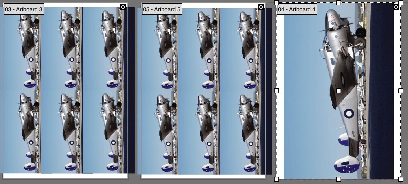
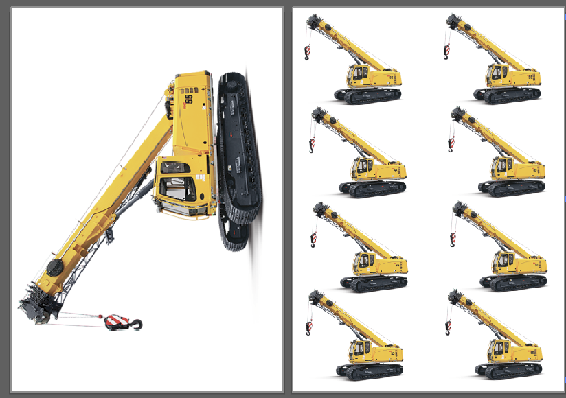
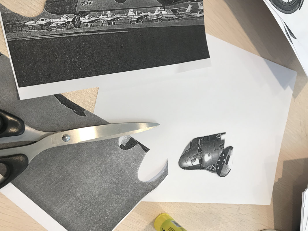
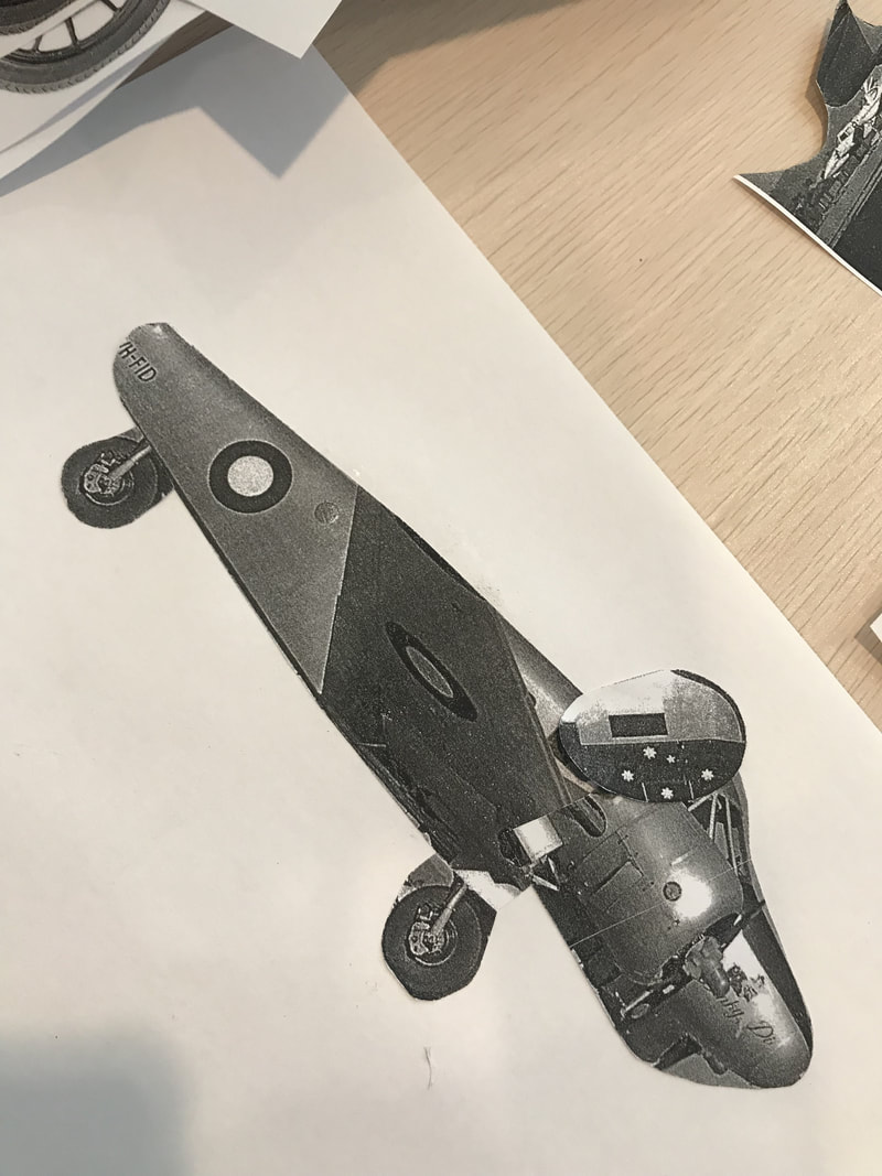
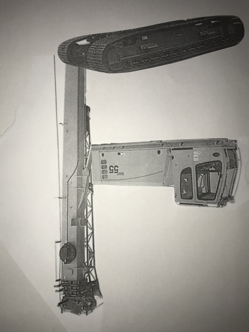
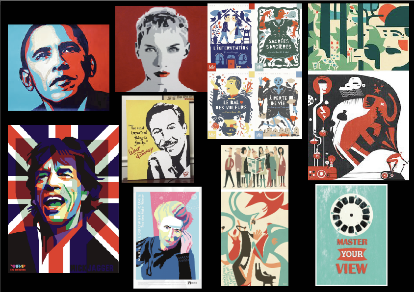
we choose two images from the folder given and I chose crane and a fighter jet. Next we use these image to deconstruct, and create another image that has different meaning. we also create the typeface from the image.
The process of colouring the image and adding stroke for the typeface, then i also add background for the image to make it more real.
Q/A
1. Did you manage to deliver a strong composition that is easy to understand?
yes, I used different colour for the image to make it more real, and also add background for the image.
2. What makes the image composition attractive to the viewer?
it is made by using the part of the crane and fighter jet, and create another different meaning of image.
3. What is the message to your viewer?
be creative and see things in the different perspective.
4. What makes the strongest visual impact in the image composition?
it makes people to think twice to realise that the image is actually made by the part of the crane and fighter jet.
Museum Macan visit


viscom GD news (assignment 1)
| berita_viscom_gd.pdf |
Research about the news and some fact.
Creating moodboard
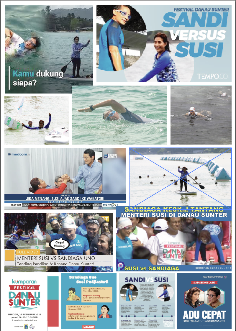
Exploring references about the art style
Sketch poster


Start creating the poster
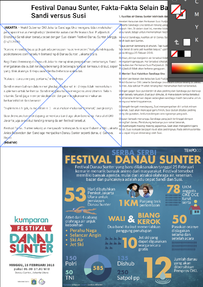
1 find the two main character of the news and trace them.
2 put them on the left and right, so it looks like a competition event
3 add the colour for the background.
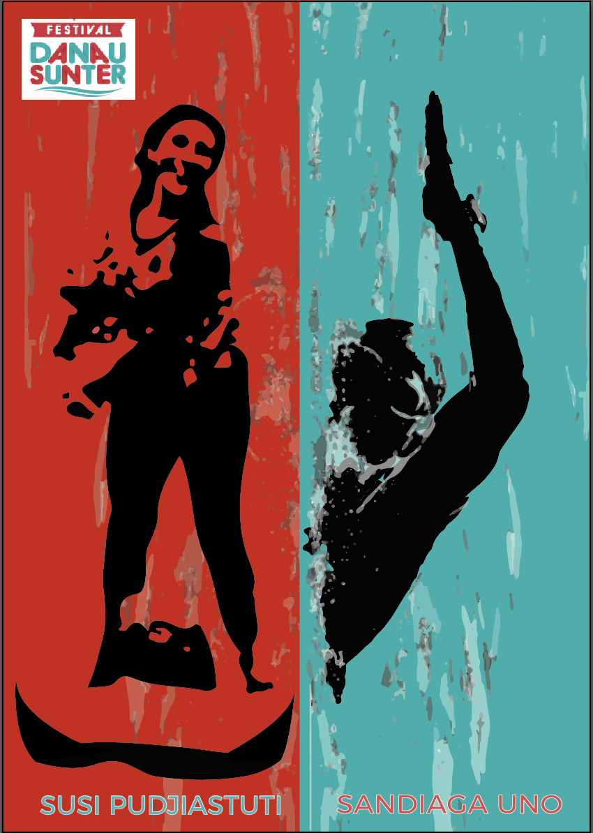
Final artwork, adding the lake to show the location, and also adding some people besides the lake to show the excitement and crowd of the competition.

WEEK VII
infographic poster
-concept and style
-visually information
-hierarchy
-establish flow and connection
-source
-concept and style
-visually information
-hierarchy
-establish flow and connection
-source
Tips and inspiration of making infographic
| infographic_design_-_tips_and_inspiration_by_canva.htm |
Infographic research 3 concept
- Public transport (Transjakarta)
- How does excavator work
- cars wheel drive
- Public transport (Transjakarta)
- How does excavator work
- cars wheel drive


chosen concept
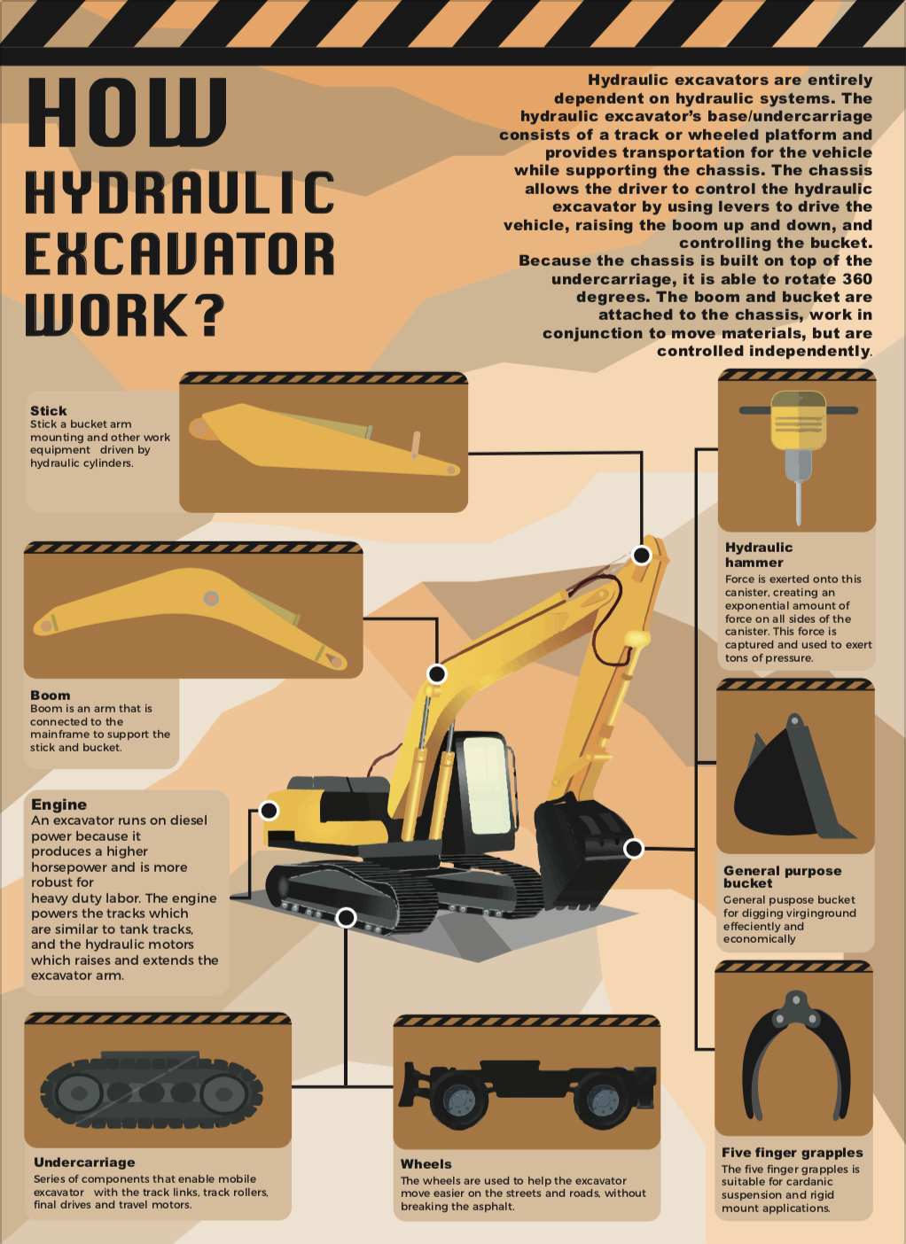
1 How does excavator work?
2 start designing
3 exploring different colour and positioning
4 Try to lowering the opacity of the background
5 exploring title position, align, leading.


Final artwork