
WEEK III
Web AUTHORING SESSION III
Websites to learn coding:
codeacademy.com
w3schools.com
freecodecamp.org
Youtube: Fun Fun Function
Flat design (references from http://uxmovement.com/wireframes)
-create your siteFlow
-develop the sketches of the webpage
-develop the wireframe
-Create your asset (artworks (vector), typeface, images)
-compose the layout: visible structure/ hierarchy of webpage (header, content, footer)
Use the convention of responsive design - design for the smartphone, tablet and monitor
notes: Tools 1-4 (manual and digital), 5-6 (Adobe photoshop, illustrator)
create phototype
tools: Adobe Xd/ sketch app? Adobe Muse
Website Design/ Development
Tools: sublime/ atom /adobe dreamweaver / adobe muse
WEEK IV
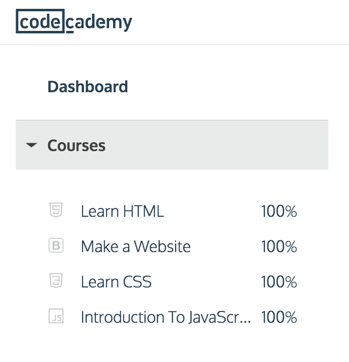
homework, finish Learn HTML, Make a website, Learn CSS and Introduction to Javascript.
WEEK V
DEVICE & RESOLUTIONS, COMMON QUESTIONS.
- what browsers do people use?
- on what their screen resolution?
- how much space is taken by the browser tools bar?
- what does it mean for me as a web site developer?
The mediaqueries workflow.
first, we ill define our so called 'breakpoints' in our CSS file. These breakpoints target the screen resolution, and more specifically the width.
we could instruct our web site to act as follows:
- if the end users screen is smaller than 480 pixels and show the smartphone layout.
- if the screen is larger than 480 pixels but smaller than 1024 pixels show the table layout.
- if the screen is larger than 1024 show the regular desktop layout.
Why target the width, not height?
- site to fit in browser windows without toolbars
- height is relative
- vertical scrolling is natural, horizontal does not
(vertical scrolling is the common, standard)
can we ignore the height?
that depends on the content of your website. very important information should be above the fold which
means: visible without scrolling. so its always good to know the available height on the most used devices
to avoid cutting off banners in the middle or putting that very important call the action button.
why not target the devise?
everyday new device are launce, it would be a hell of a job to keep everything up to date
what can i change?
- simply: put CSS rule
- change font, spacing, images, column width, layouts..
current desktop screen
screen width . smallest screen height . in use world wide
1024 px 768 . px 3 %
1280px 800 . 11
1360px 768 . 2
1366px 768 . 35
1440px 900 6
1600px 900 . 6
1680px 1050 . 3
1920px 1080 . 20
2560px and up 1440 1
CSS Breakpoints
smartphones =< 768px
small devices, tablet >768px
medium devices >992px
large devices >1200px


